King Solomon Logistics Case Study
Embracing a New Era of Branding
 The Problem
King Solomon Logistics, a freight forwarding company specializing in shipping from the U.S. to Guyana, faced significant brand identity and market positioning challenges. Despite their expertise and reliable services, their online presence and brand image did not reflect their commitment to quality and customer satisfaction. The outdated website design, lack of a coherent brand voice, and inconsistent messaging failed to differentiate them from competitors, causing missed opportunities in acquiring new clients and retaining existing ones.
King Solomon’s Old Website and Logo

Old Logo
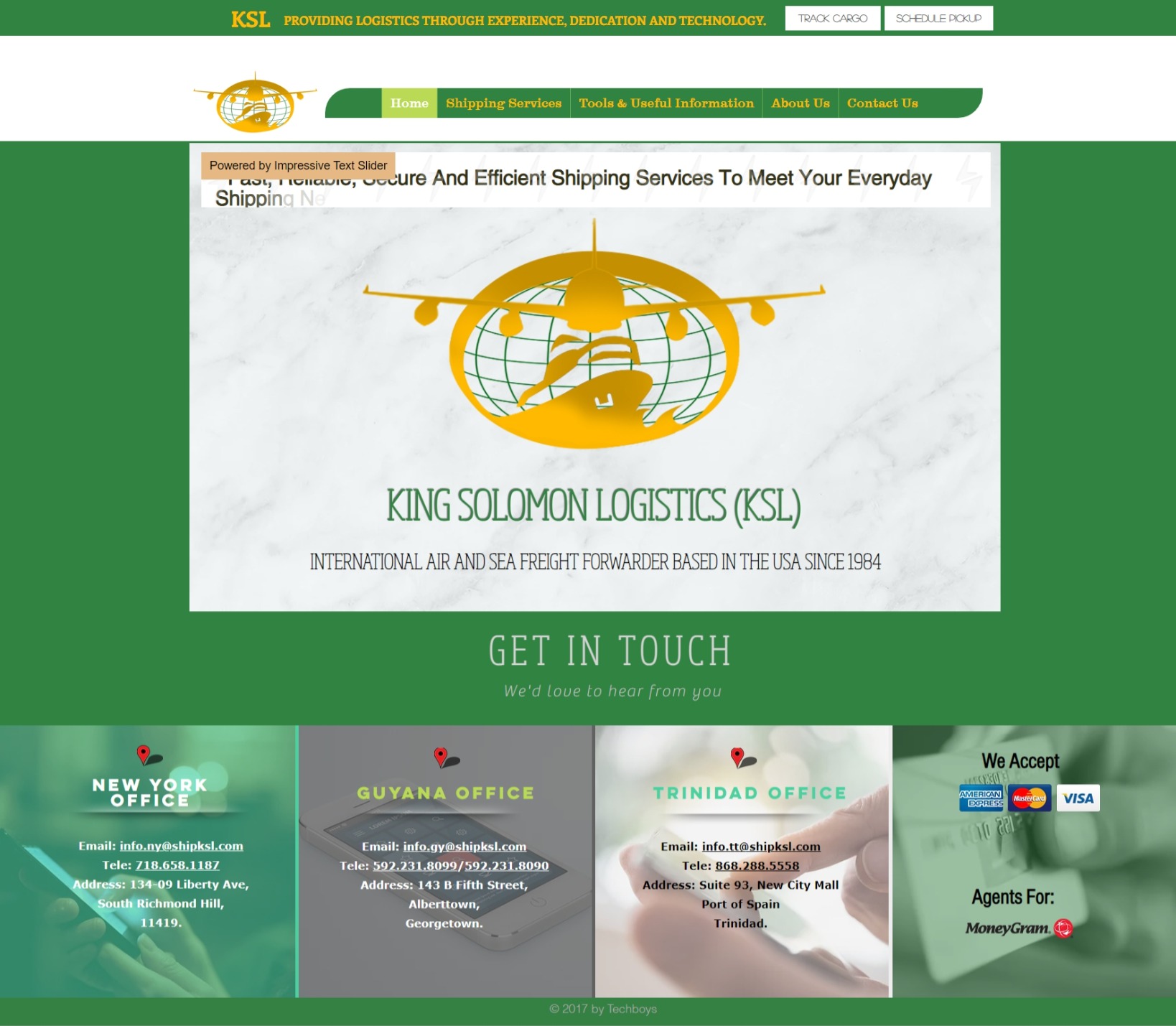
Old Website
This lack of a strong digital identity was not just a minor inconvenience—it was a critical gap that threatened King Solomon Logistics’ growth. The company’s message was getting lost amidst the clutter of the digital marketplace, leading to reduced visibility and lost business opportunities. With more competitors entering the market, a poorly defined brand meant that King Solomon Logistics struggled to communicate its value proposition effectively.
Competitors’ Logos

The Solution
Recognizing the need for a strategic brand overhaul, King Solomon Logistics partnered with us to redefine its brand and build a compelling digital presence. Our approach was comprehensive:
Discovery Phase: During our initial discovery phase, we uncovered that King Solomon Logistics desired a brand image that was modern, vibrant, comfortable, and friendly. They wanted a welcoming tone of voice that resonated with their diverse customer base. We decided on three core brand attributes: Friendly, Vibrant, and Family-Oriented. These attributes would guide the entire branding direction, ensuring that the new identity was not only visually appealing but also emotionally engaging and approachable.
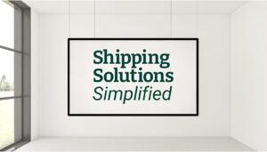
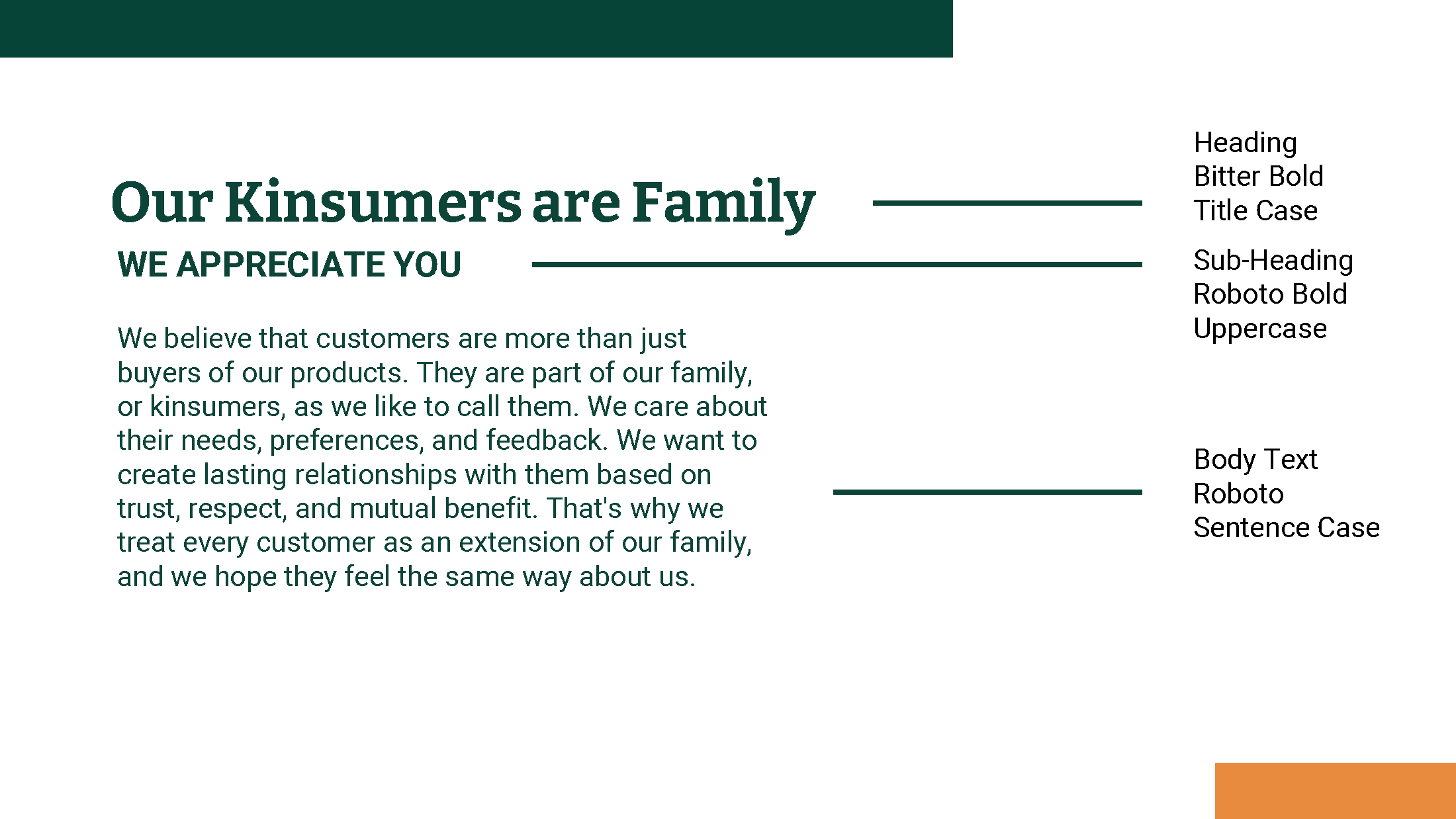
Stylescape Development: To visually capture the essence of these attributes, we created a stylescape—a curated collection of images, colours, typography, and design elements that embodied the desired look and feel. This stylescape became the blueprint for the brand’s visual identity, replacing traditional mood boards to provide a more comprehensive and aligned vision for the brand.
Design Stylescape
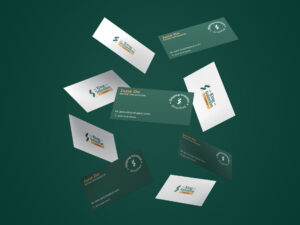
Brand Strategy and Visual Identity: With the stylescape as our foundation, we developed a cohesive brand strategy that included a new logo, color palette, typography, and a unified brand voice that communicated reliability, efficiency, and trust, while also being friendly and approachable.
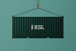
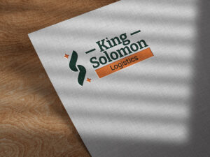
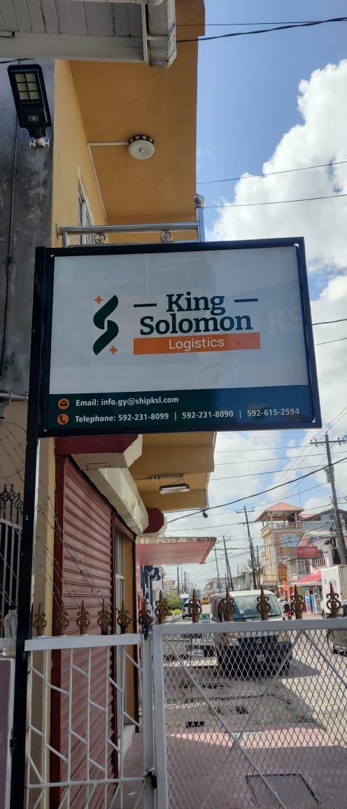
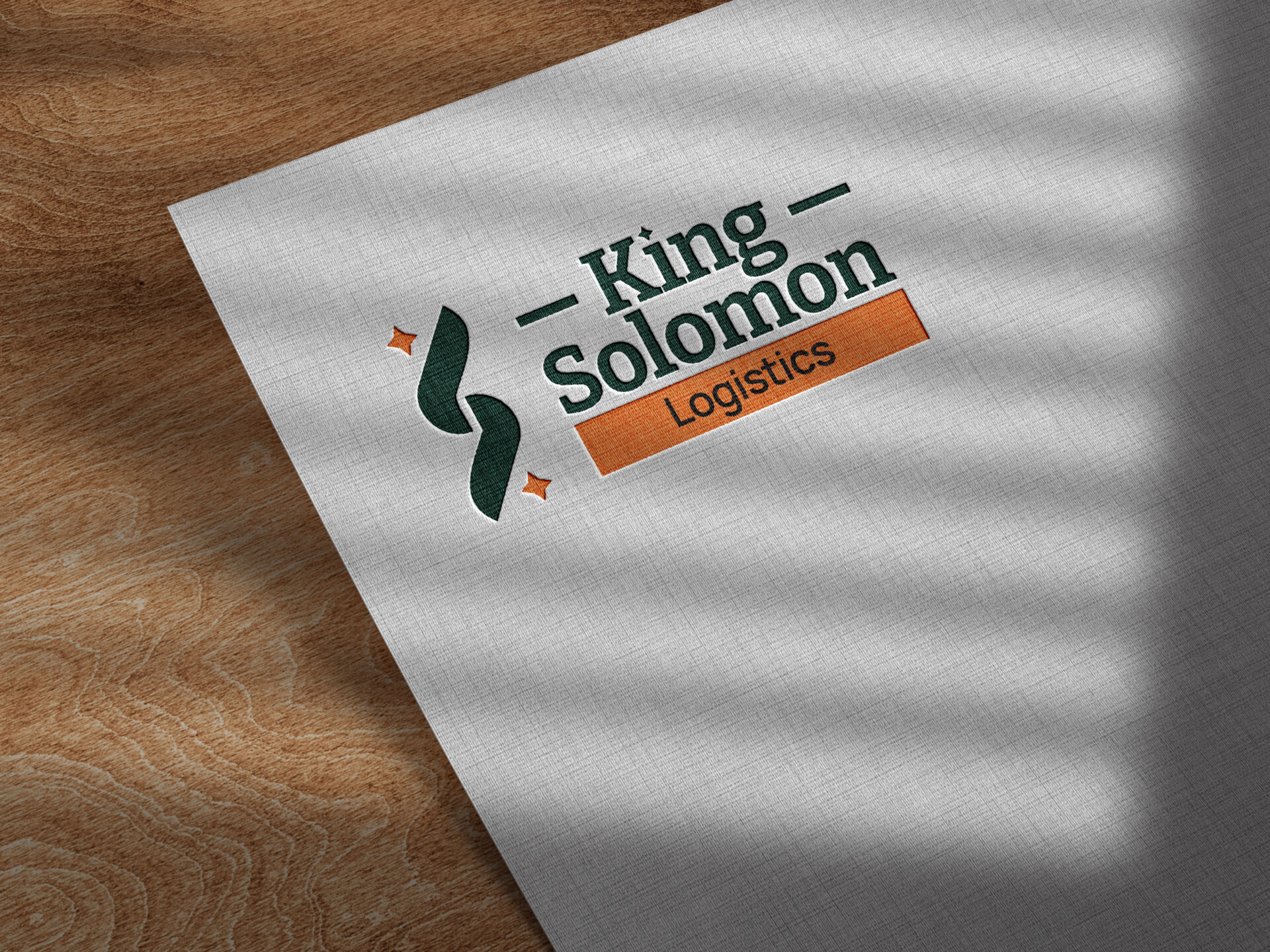
New Logos
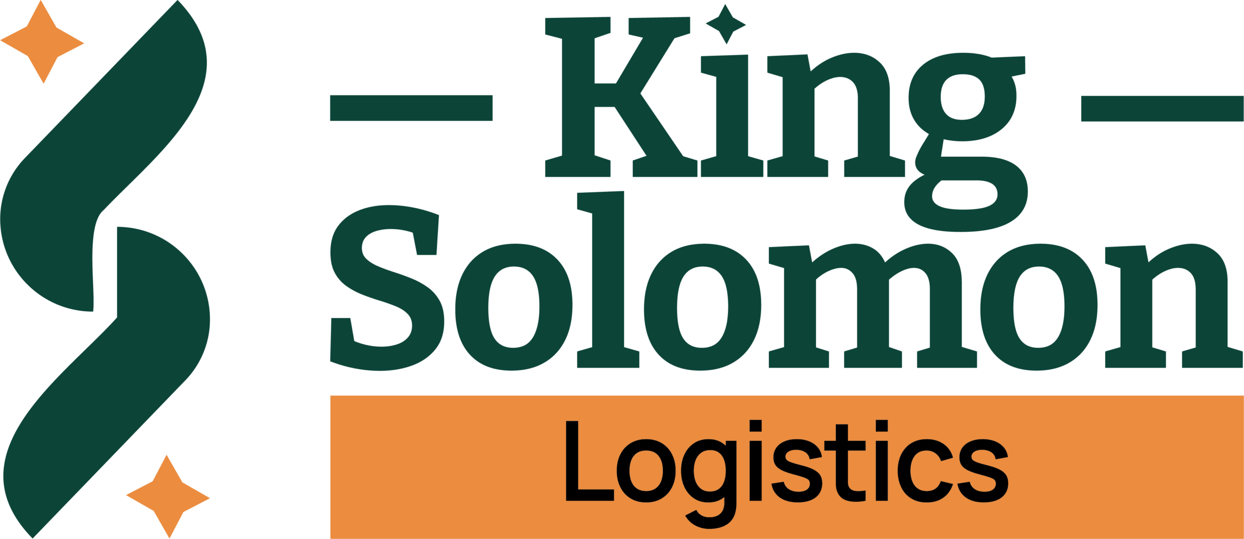
Primary Logo

Secondary Logo

Badge Logo

Icon
Brand Colours

Tropic Glow

Solomon’s Sage

Harbour Haze
Brand Fonts
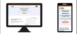
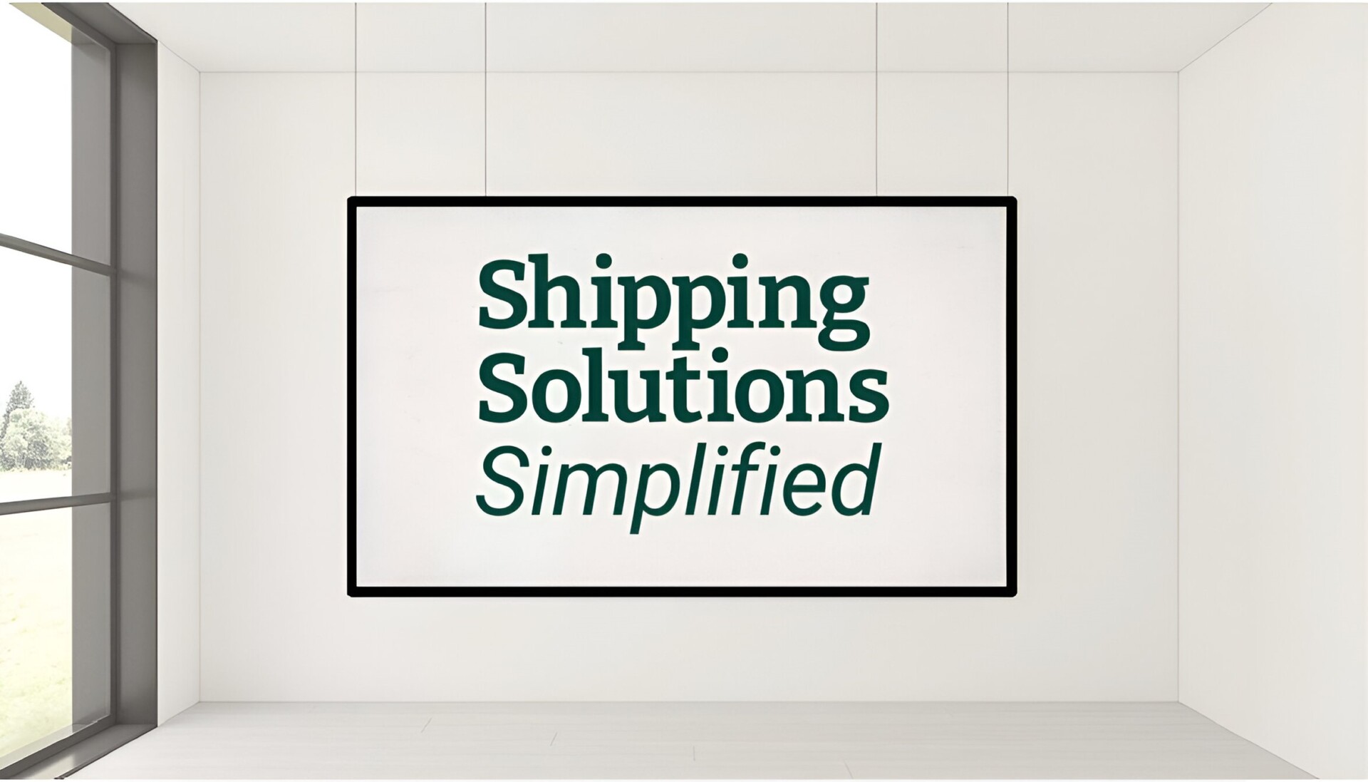
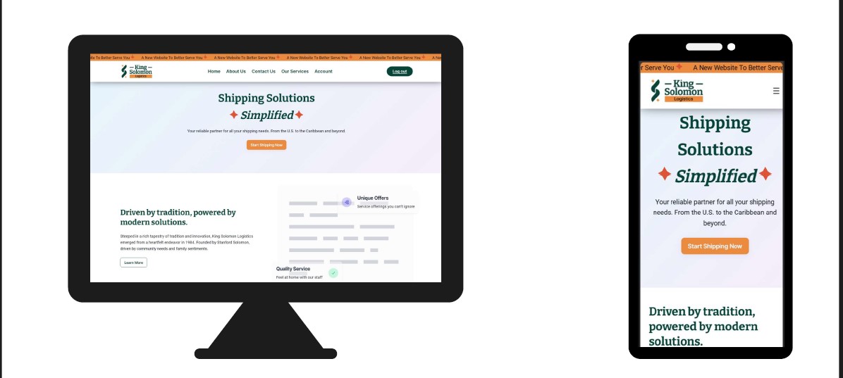
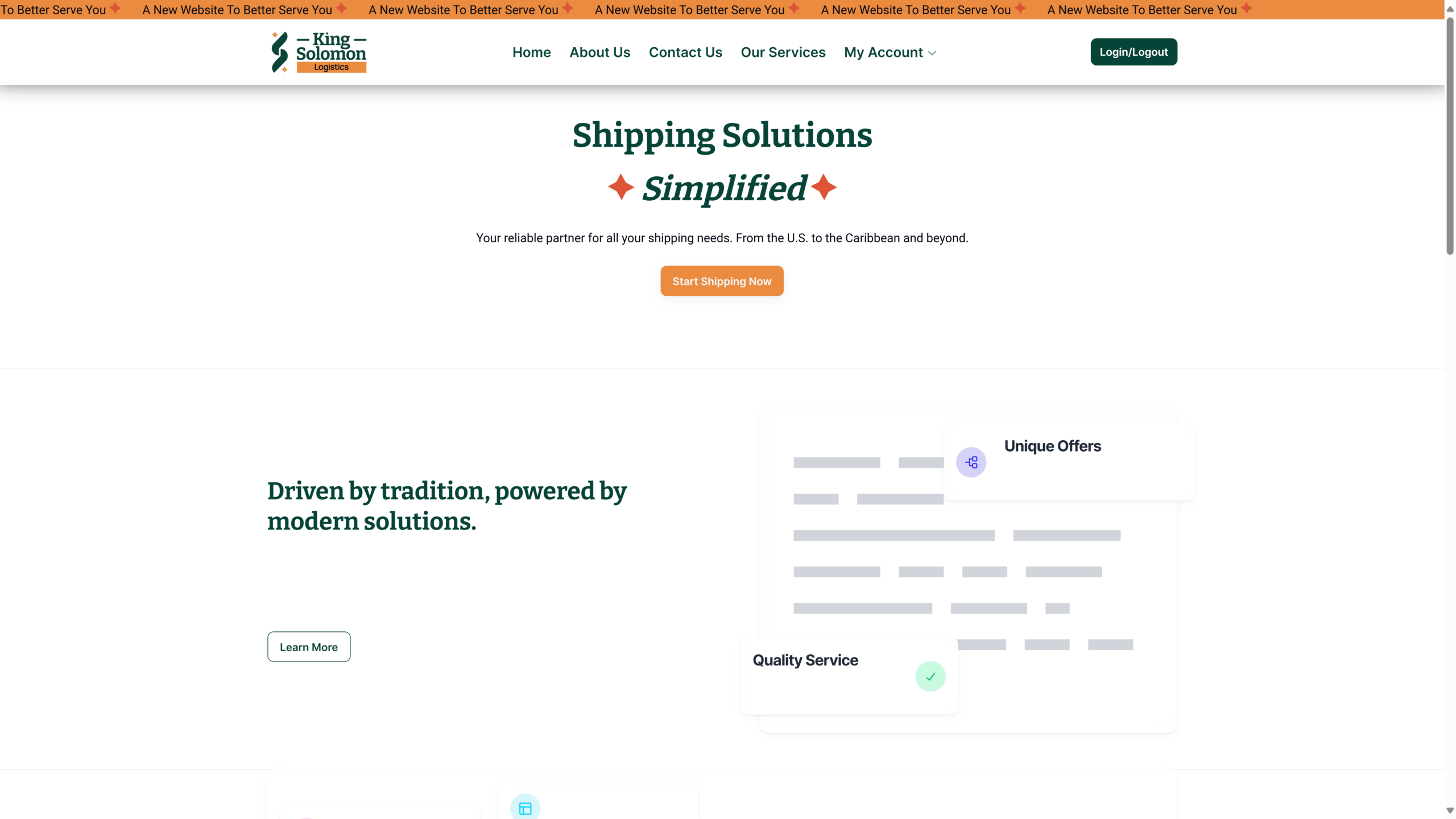
Website Redesign: The website was completely redesigned to align with the new brand identity and to improve user experience. Key improvements included:
- Modern and Clean Design: The website now features a modern and clean design with a vibrant colour scheme that reflects the brand’s attributes. This design not only improves aesthetics but also enhances readability and user engagement.
- User-Friendly Navigation: We implemented a simplified navigation structure, making it easier for visitors to find the information they need quickly. The new menu layout and clearly defined sections guide users intuitively through the site.
- Responsive Design: The website was optimized for all devices, ensuring a seamless experience whether accessed from a desktop, tablet, or smartphone. This responsive design caters to the growing number of mobile users and enhances overall accessibility.
- Enhanced Service Pages: Each service page was revamped with detailed descriptions, vibrant imagery, and clear calls-to-action (CTAs). These improvements help visitors understand the full range of services offered and encourage them to take the next step.
- Interactive Elements: New interactive elements, such as contact forms and live chat options, were integrated to improve customer interaction and make it easy for potential clients to reach out directly from the website.
- SEO Optimization: The site’s content was optimized for search engines to improve visibility. This included keyword optimization, meta descriptions, and alt tags, all of which help attract more organic traffic and increase search engine rankings.
New Website
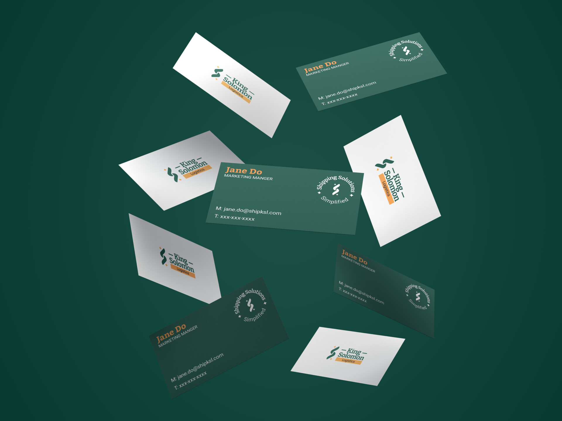
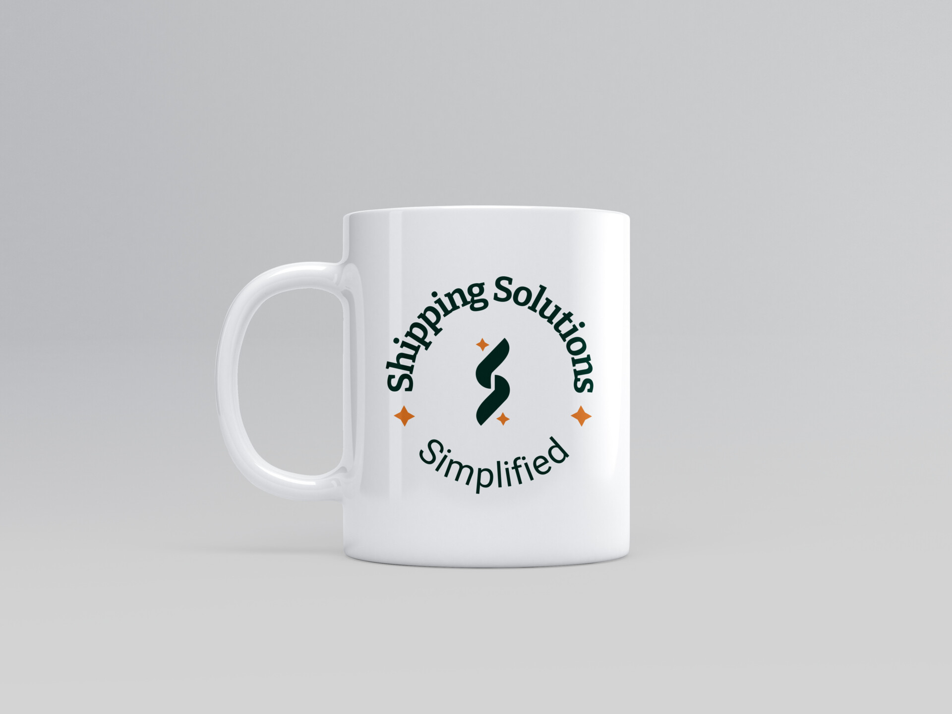
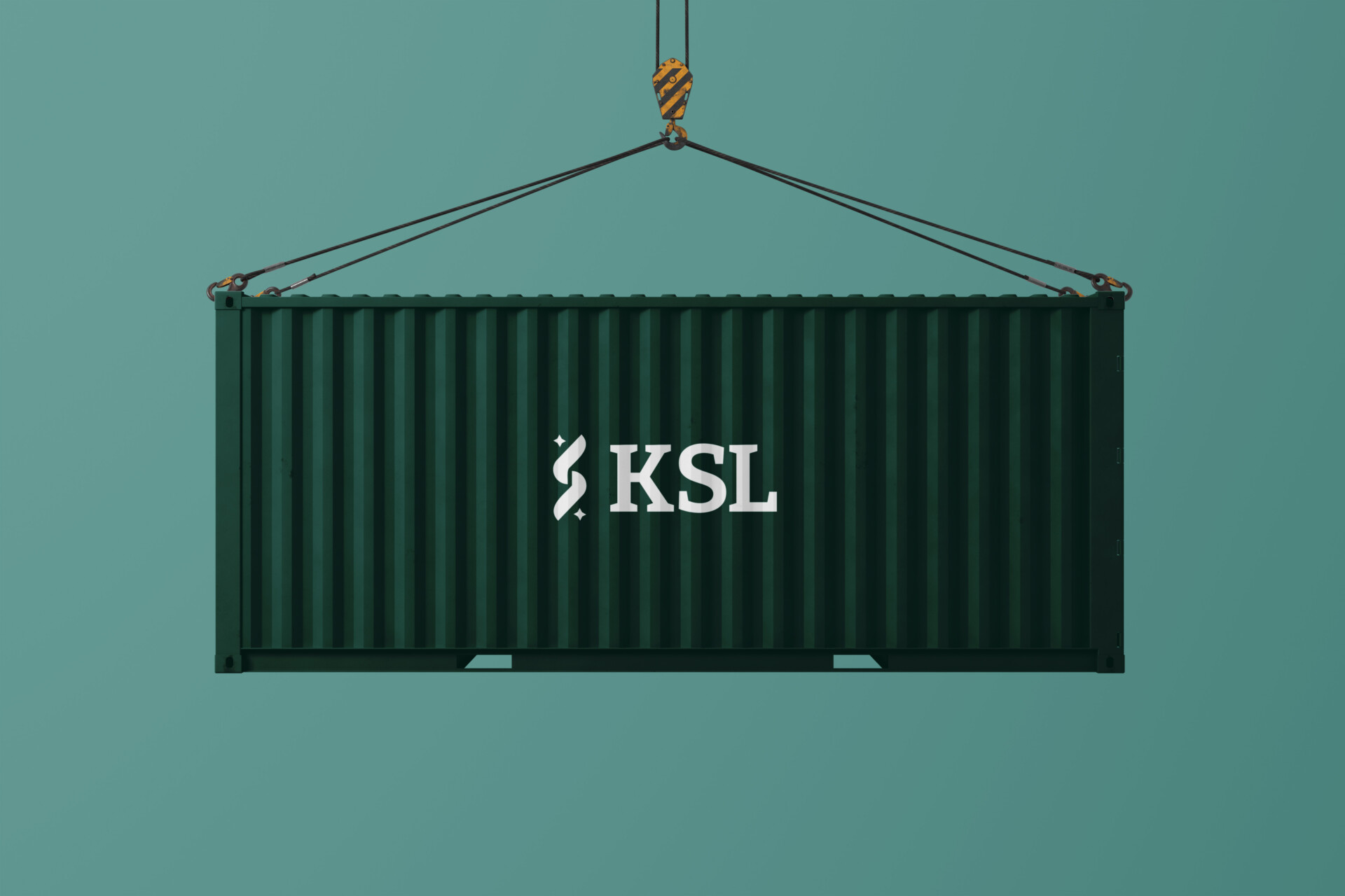
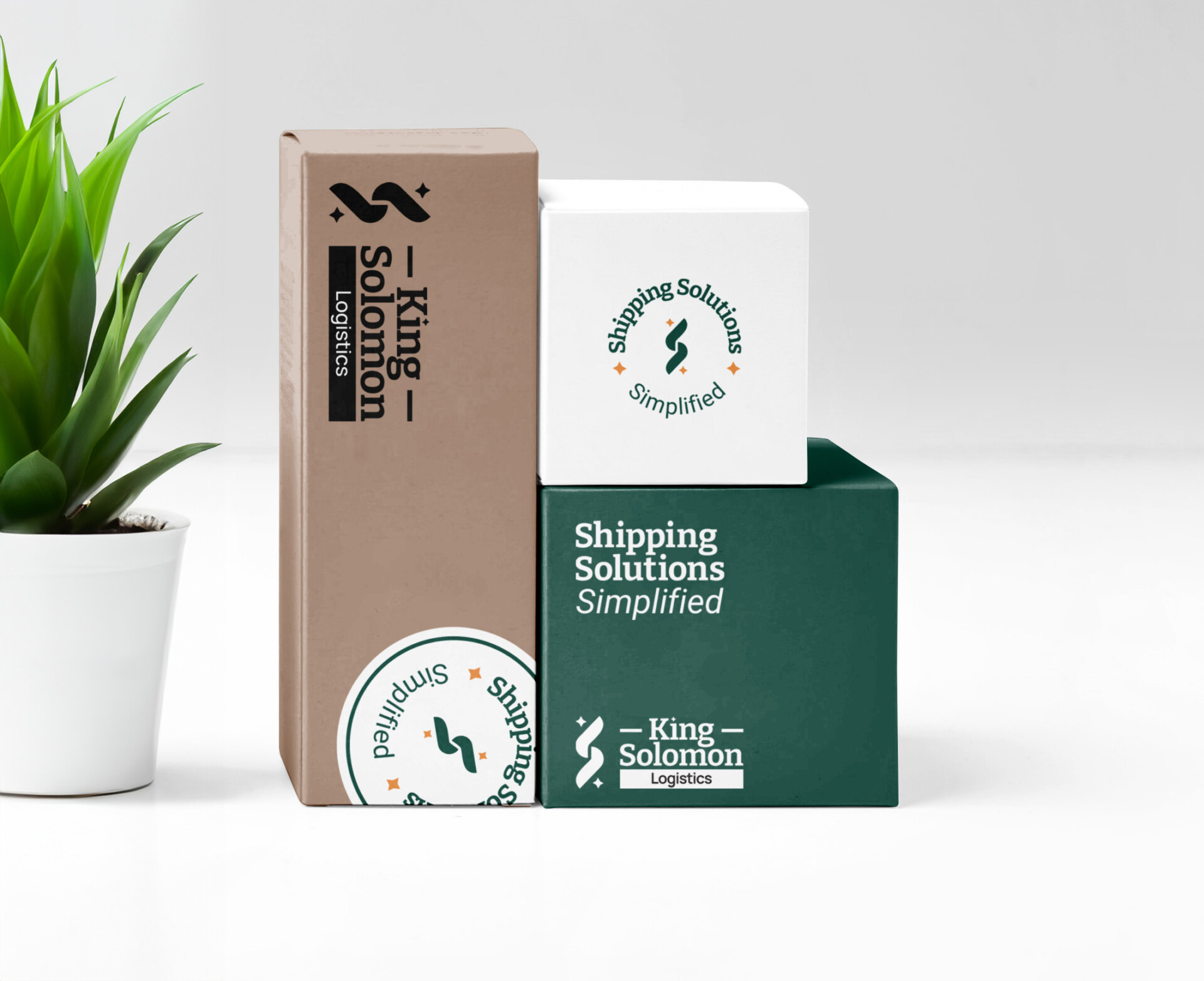
Brand In Use