HarmonY Pharmacy
Building a Strong Foundation
About The Brand
Harmony Pharmacy is a new pharmacy committed to providing sustainable healthcare solutions. Their focus is on offering a healing journey with knowledgeable guidance, targeting health-conscious individuals and those needing continuous treatment. With a mission to deliver “For Sustained Healthcare,” Harmony Pharmacy needed a clear brand identity and a strategic approach to connect with their audience effectively.
Where we began
Harmony Pharmacy started with a powerful vision but lacked a defined brand identity and strategy to reach its audience. They needed to establish who they were and communicate their unique mission to potential customers.
Discovery Phase
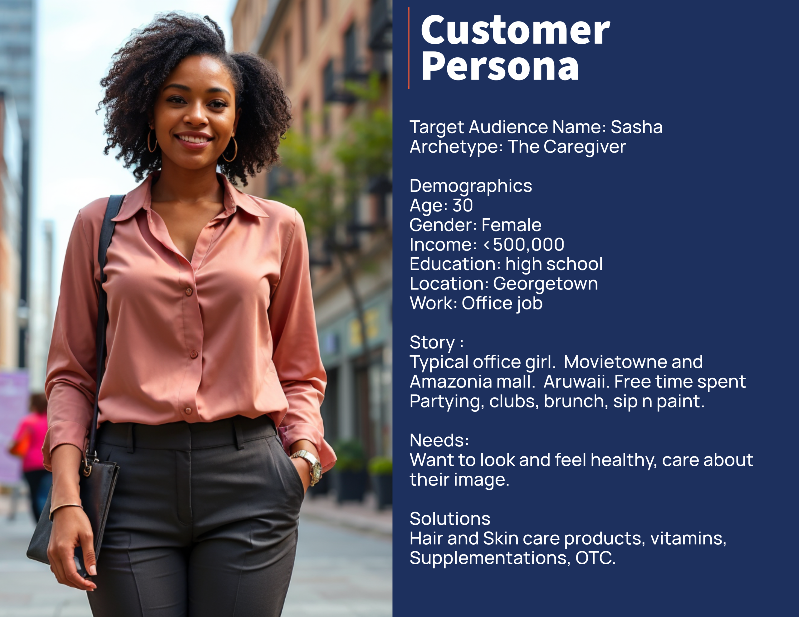
The Discovery Phase is a crucial step in the brand development process where we dive deep into understanding the essence of the business. For Harmony Pharmacy, this phase involved workshops and collaborative sessions to define their target audience, business model, goals, values, and mission. We explored what makes Harmony unique and how to position them in the market effectively. This phase helped us establish a solid foundation for the brand, ensuring every decision made moving forward aligned with their vision of providing sustainable healthcare.
Where It Took Us
Today, Harmony Pharmacy has a distinct brand identity that reflects its mission of “For Sustained Healthcare.” They have a strong presence on social media, sharing valuable content that resonates with their audience, from health tips and educational posts to product announcements and customer stories. Custom Instagram templates ensure a consistent and professional look, setting them apart in the healthcare market.
Examples of Social Media Posts
How We Got There
Synth partnered with The Chelsea Foundation from the very beginning, helping to outline their brand values, develop a memorable visual identity, and define their target audience. We then designed and developed a user-friendly, visually appealing website tailored to their needs. This strategic approach has helped The Chelsea Foundation establish a strong presence and connect deeply with their community.
Reference Images
Design Stylescape
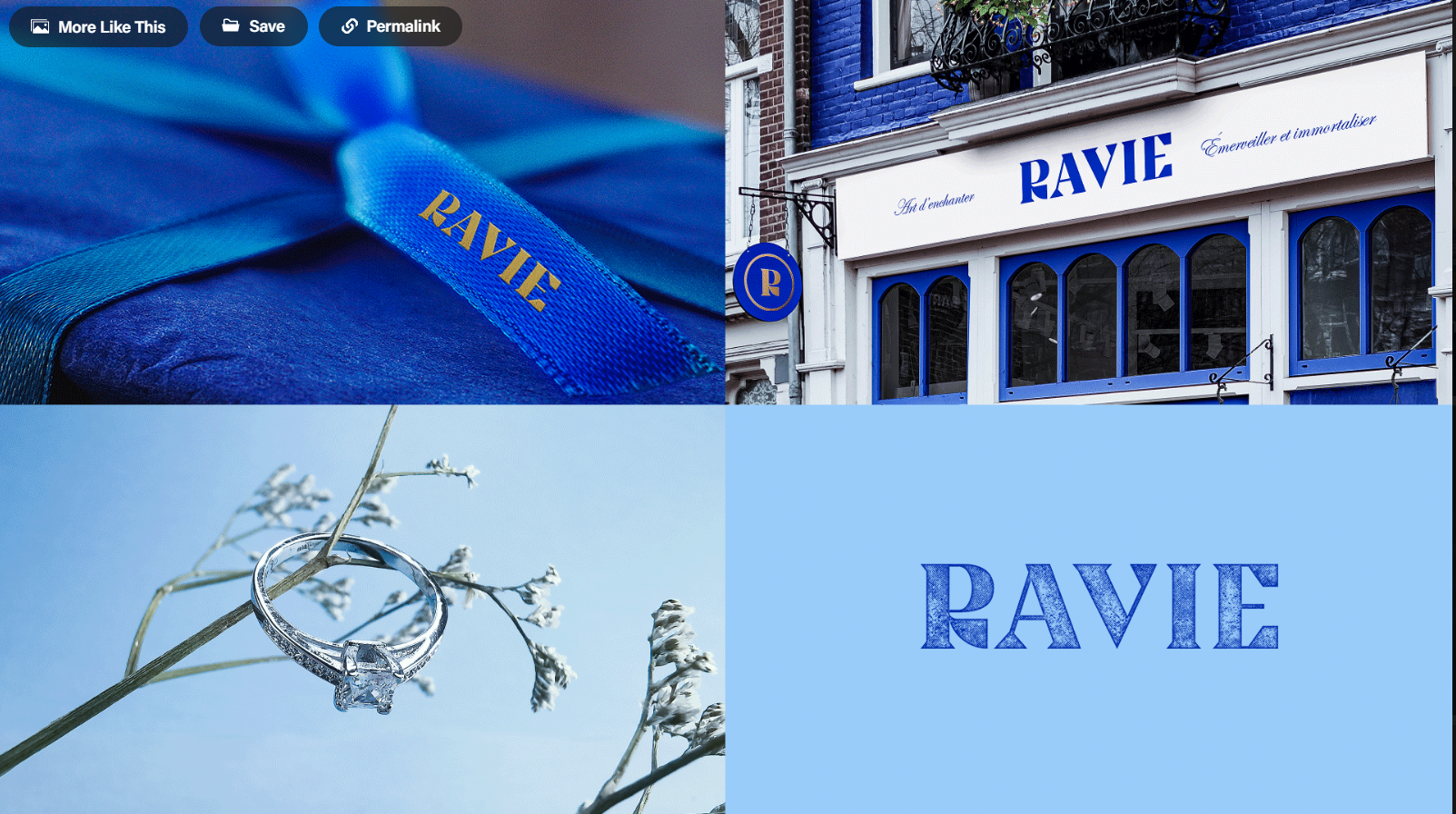
Stylescapes are visual mood boards that combine various design elements, such as colours, typography, imagery, and textures, to create a cohesive visual direction for the brand. During Harmony Pharmacy’s brand development, stylescapes were used to present different design directions and align the visual aesthetic with their values of luxury, empathy, and professionalism.
Early Sketches
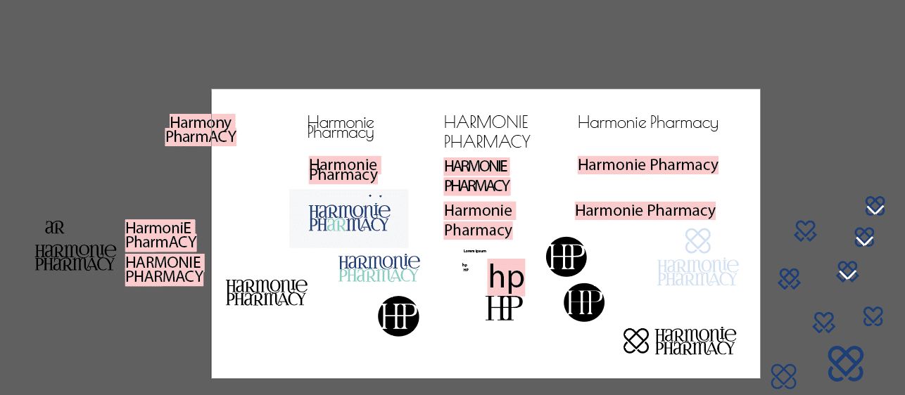
Sketches are the initial drafts of the brand’s visual elements, such as logos and icons. They capture early ideas and concepts, allowing for quick iteration and refinement. Sketches help shape the final design by visualizing different possibilities and gathering feedback.
Brand Strategy and Visual Identity:
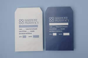
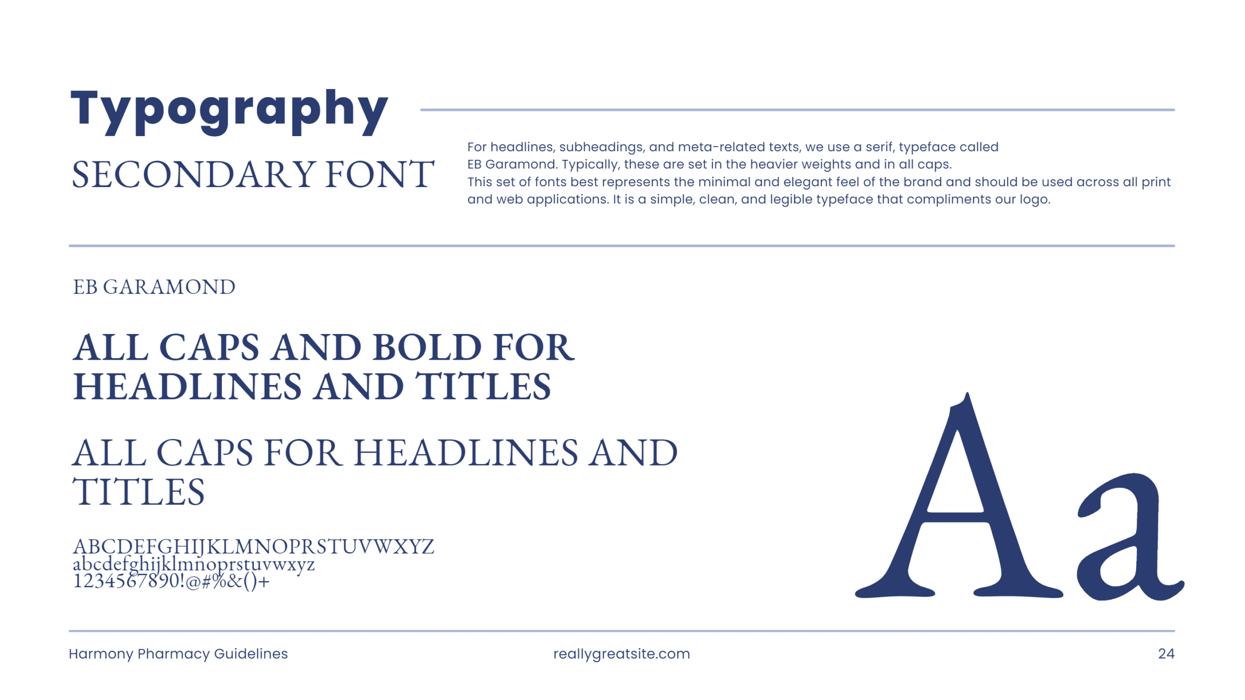
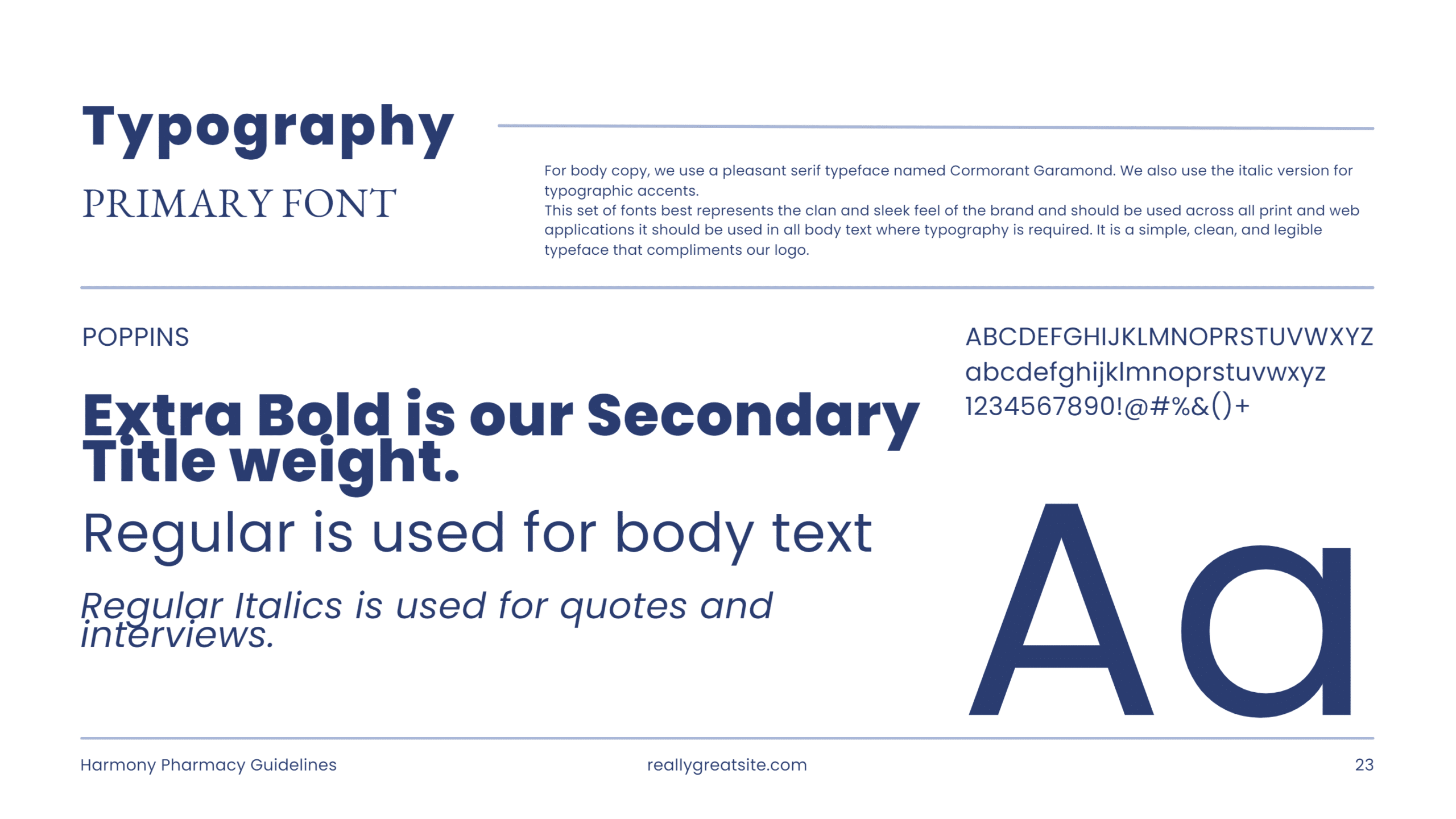
With the stylescape as our foundation, we developed a cohesive brand identity that included a new logo, colour palette, and typography.
New Logos
Brand Colours
Brand In Use


